

Key Takeaways
- – Start with one message that explains what the coin honors or remembers.
- – Use symbols, shape, relief, and color to reinforce that message.
- – Prioritize clear focal points over crowded collections of small details.
- – Keep lettering brief, accurate, and easy to read at the coin’s actual size.
- – Review both sides together so the finished coin feels like one complete story.
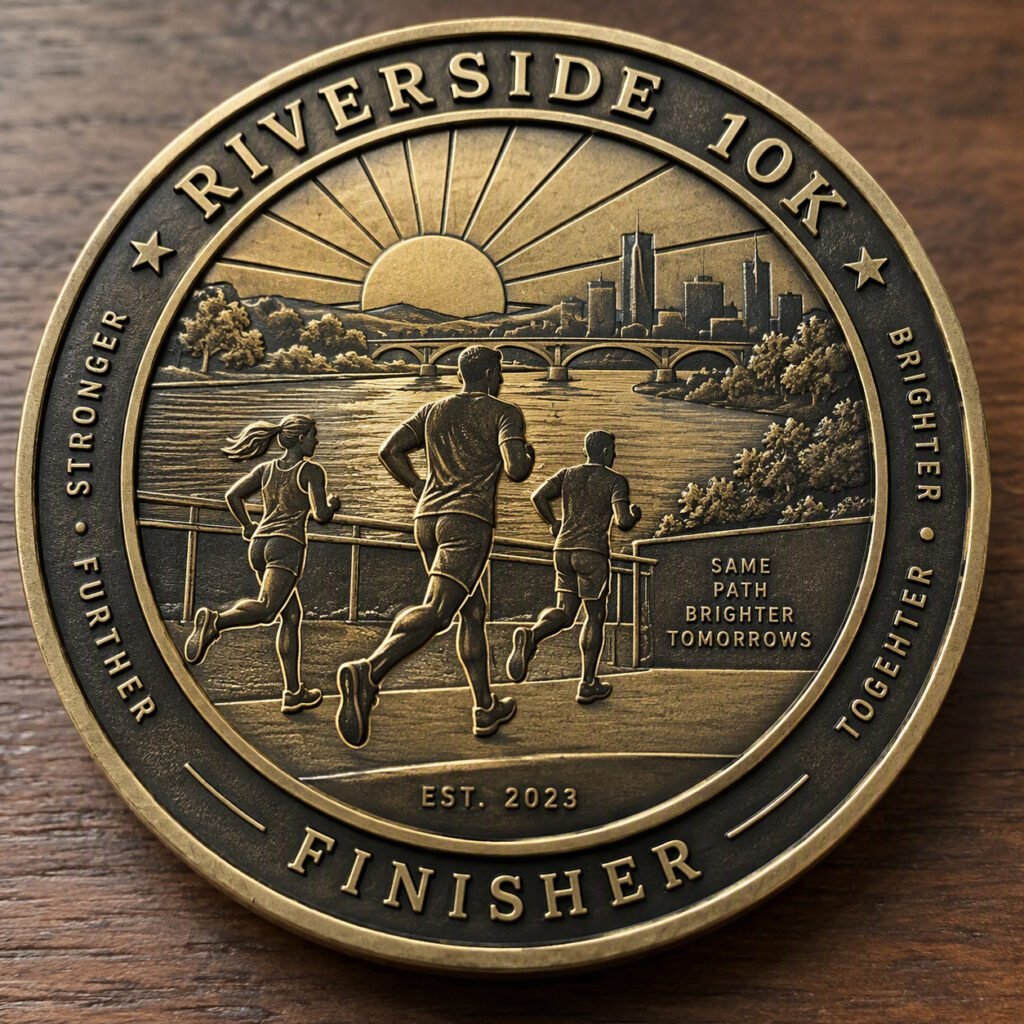
A challenge coin is a small object with a big job. It can recognize service, preserve a milestone, represent a team, or remind someone of a shared experience. The most effective designs communicate that purpose quickly, then reveal more meaning as the holder studies the artwork. Options such as custom 3D challenge coins can add sculpted dimension, but the story should always guide the design choices.
Whether the coin marks a retirement, an anniversary, a public-service achievement, a charitable event, or a team accomplishment, every element should feel intentional. Shape, texture, color, lettering, and the reverse side all work best when they support one clear idea.
Why Visual Storytelling Matters On A Challenge Coin
Good coin design works at two distances. From across a room, a strong silhouette, central emblem, or contrasting color should make the subject easy to recognize. Up close, smaller details can reward attention: a meaningful date, a landmark, a tool of the trade, a motto, or a subtle background pattern. That balance helps a coin feel collectible without becoming confusing.
Symbols are especially useful because they can carry meaning without requiring a long explanation. An animal may stand for local identity, a compass may suggest direction or exploration, and a building may connect the design to a specific place. The right symbols are not simply decorative. They give the recipient a visual reminder of why the coin exists.
Start With One Clear Message
Before sketching, write one sentence that states the coin’s purpose. For example, “This coin honors five years of volunteer service,” or “This coin celebrates a department’s successful launch.” That sentence becomes a filter for every later decision. If a proposed image, phrase, or color does not strengthen the message, it may not belong on the coin.
Questions To Answer Before Sketching
- – Who will receive the coin, and what connection do they share?
- – What achievement, occasion, or memory does it represent?
- – What feeling should the recipient have when holding it?
- – Which single symbol best expresses the central idea?
- – Which names, dates, or phrases are essential?
Use Shape To Set The Mood
A round coin feels classic, balanced, and adaptable. A custom outline can create a more immediate association with a badge, shield, state, vehicle, building, mascot, or piece of equipment. Neither option is automatically better. The best shape is the one that makes the story clearer without making the layout harder to read.
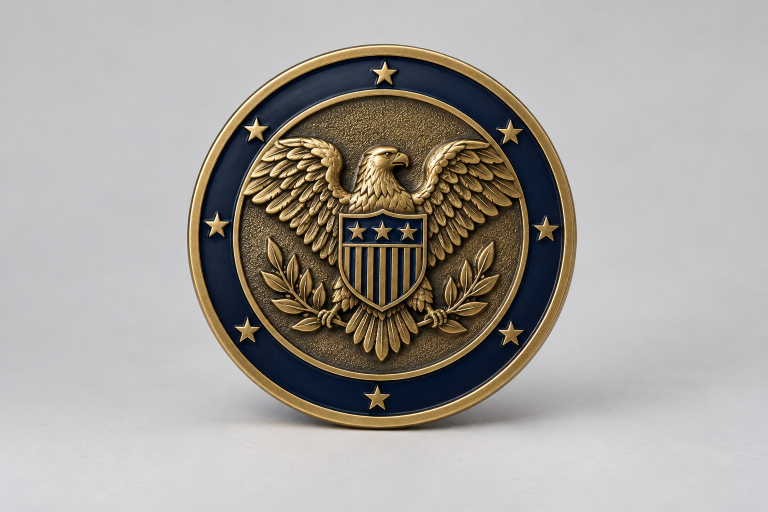

Practicality matters when selecting an outline. Extremely thin sections, sharp points, deep cutouts, and busy edges can compete with the artwork or limit space for lettering. A distinctive shape should still leave room for a focal image and an uncluttered border.
Build Depth With Relief And Texture
Raised and recessed metal areas help establish visual hierarchy. A raised portrait, badge, animal, vehicle, or landmark can become the dominant feature, while a recessed field can provide contrast behind it. Texture also changes how light moves across the surface, giving the design more presence in the hand.
Use relief with purpose rather than treating it as an extra effect. A textured background can separate lettering from the field, and a layered border can frame the central image. Fine details should remain secondary to the main symbol, especially when the coin is viewed at arm’s length.
Details That Often Work Well
- – Raised focal images that establish the subject immediately
- – Recessed patterns that add depth without distracting from the emblem
- – Layered borders that organize text and visual elements
- – Small personal marks, such as coordinates, dates, or insignia
- – Textured fields that improve separation between metal and lettering
Choose Color And Lettering With Care
Color should direct attention, not fill every open area. A limited palette can make a central emblem stand out and help the viewer distinguish between foreground and background. Strong contrast is particularly useful when text sits over a colored field or when several symbols share one side of the coin.
Lettering needs the same discipline. A short motto, location, date, name, or event title can add lasting meaning, while a paragraph of copy is likely to feel crowded. Use only wording that contributes to the story, and inspect the proof at the intended size rather than judging it only on a large screen.
Lettering Checklist
- 1. Keep the main phrase short and meaningful.
- 2. Make essential words larger than supporting text.
- 3. Use curved text only when it remains comfortable to read.
- 4. Check every spelling, initial, rank, date, and abbreviation twice.
- 5. Confirm that contrast makes each line visible in different lighting.
Balance The Front And Back
The front and back should feel connected, not like two unrelated projects. One side might feature the main emblem, while the other carries a supporting symbol, date, motto, or acknowledgment. Repeating a border style, metal finish, color family, or visual motif can create unity without making both sides identical.
Use History And Medallic Art As Design Guides
Challenge coins are closely associated with group identity, recognition, and service. The challenge coin tradition shows why shared symbols and memorable emblems remain important to many recipients. Historical influence does not, however, require an old-fashioned result. A modern coin can use clean layouts and contemporary imagery while still honoring tradition.
Traditional medals also offer useful lessons in visual storytelling. Portraits, dates, borders, and symbolic objects have long been used to preserve events in a compact format. Looking at coin design studies displayed by the Smithsonian can reinforce the value of testing concepts before approving a final composition.
A Practical Design Process
- 1. Write the message: Define exactly what the coin should honor.
- 2. Select the focal symbol: Choose one image that carries the most meaning.
- 3. Sketch multiple layouts: Test image placement, borders, and text.
- 4. Add depth selectively: Use relief and texture to establish order.
- 5. Limit colors: Choose shades that support readability and mood.
- 6. Review both sides together: Check for a consistent visual language.
- 7. Inspect the final proof: Look closely for tiny text, crowded areas, and factual errors.
Common Design Mistakes To Avoid
- – Trying to include every symbol connected to the group
- – Using long text or lettering that is too small to read
- – Choosing details that disappear at final size
- – Relying on color alone to separate important elements
- – Ignoring edge treatment and the coin’s overall silhouette
- – Approving dates, names, or abbreviations without a careful review
Conclusion
A meaningful challenge coin does more than display an image. It preserves a story through shape, texture, contrast, lettering, and symbols chosen for a reason. Start with one clear message, give the main image room to lead, and review each detail against the coin’s purpose. The result can be a keepsake that feels personal, readable, and worth holding onto.