Whether a page was deleted without a redirect or the user typed the wrong URL, 404 Not Found Errors are an internet fact of life. No website is immune to displaying a 404 page, but too many businesses put no effort or thought into how they look.
While an exit intent pop-up that offers a sale is designed to keep shoppers on the page, custom 404 pages can be even more effective at retaining visitors. The difference lies in the fact that a 404 page already has the user with intent whereas someone trying to exit a page has more or less made up their mind.
A well-designed 404 page is a brand’s chance of making a strong first impression, reaffirming trust in a known relationship, and bolstering credibility across the board.
Here’s how to design your own user-friendly 404 page in five easy steps:

1. Tell the User What Happened
The central purpose of a custom 404 page is to deliver a better user experience, which makes no detail of a page more integral than explaining the issue to the user in clear language. You might be thinking, if the issue is the page no longer exists, aren’t there only so many ways to say that? Yes, and no. While you shouldn’t try too hard with your error copy, you should be injecting your brand’s personality into how you say what you say.
2. Give Them Helpful Places To Go
Any user landing on a 404 page will be understandably frustrated. A quick way to turn the interaction around is to offer convenience. Include links to all the high-level areas a user might want to go, such as your homepage, help page and contact page. Depending on the business, additional links may also be helpful, just be careful to avoid cluttering the page. After all, the goal is to solve the user’s problem, not add to it. Include a search bar in your link menu to cover your bases.
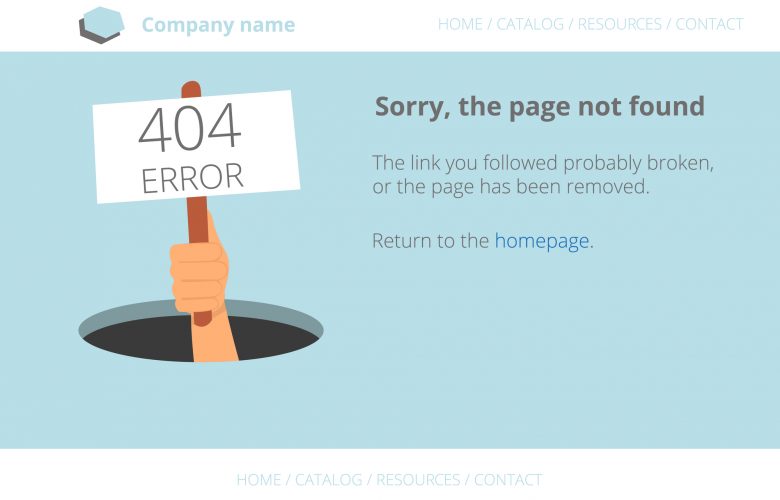
3. Enhance the Message with an Image
It’s certainly not a requirement to have an image or graphic on a 404 page. However, they can contribute to the user experience and help keep visitors on the website. A clear message and high-level linking go a long way toward accomplishing them. But humans are visual creatures at their cores, processing images in as little as 13 milliseconds. If you can pair the right graphic with your copy, users will understand the message quicker and feel good about it—if your graphic both engaged them and clarified the situation.
4. Make Sure It’s On-Brand
You could have clearly worded unique copy, a well-structured navigation layout and a complementary graphic to complete the page, but unless it’s all done through your brand’s unique lens, you’ll miss out on a major opportunity to stick in the minds of first-time visitors. Aside from your homepage, no other page on your site is geared to every type of visitor. It’s a chance to solidify your style and presence as well as your personality and tone. If you used one of the best e-commerce website builders like Shopify to design your store, you’ll have a number of branded options for how you can make your 404 page look.
5. Keep the 404 Page Consistent with Your Site’s Overall Appearance
Your 404 page is essentially the concierge of your company. It’s designed to assist when needed, in the most fluid manner possible. But it can’t do that if the user feels they’ve been sent to a random site. If your 404 page doesn’t look like the rest of your website pages in layout, color, navigation and logo placement, you could confuse or alarm visitors and cause them to bounce. Visitors arriving on your 404 page from another page on your site shouldn’t feel like they’ve left your website. In some cases, it might even make sense for a 404 page to contain nothing more than a message and their top-level navigation.
Creating a custom 404 page won’t drive instant revenue or lead to a surge of new loyal users overnight. However, it will reduce a site’s overall bounce rate, leave first-time visitors with a positive impression about a business and give brands the chance to turn initially frustrated users into eventual loyal customers.